
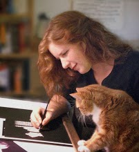
It is finished!
Unfortunately I managed to lose the in-progress photos that I took as I worked, so we'll just have to skip to the end!
Day 2 of work was much more difficult - I was having trouble getting into R-mode ("The Art Zone" as the hubby calls it) and it was the final stretch of the picture which is always more tedious than I think it will be. But the difference between 'art for fun' and 'art for work' is that I don't have the luxury of walking away - so I sat at the easel and kept plugging away. And here it is at the end of Day 2:

So after this it was time for bed - with four steps left until the end:
1) 'the hubby-check', 2) 'turning it to the wall', 3) 'peer review' and 4) 'revisions'.
It passed the hubby check with flying colors – though not an artist he has a good eye, and often points out trouble spots that I may have missed. One down.
Before I 'turn it to the wall' I make a few small notes – I'd like to darken the deeper crevices in the cloth in the upper half. I think the reflections on the upper half of the bells need to be darker, and there's a reflection on the third bell that I've not made clear enough. I wrote these on a post-it which goes on the easel beside the work-in-progress. Now I'll walk away from it for at least 10 hours, have a good night's sleep – and when I come back with 'fresh eyes' I'll see any errors more clearly.
Before bed I also posted it to Wetcanvas– a wonderful forum for artists of any kind! This is the 'peer review' part – artists of all levels will give me feedback on the work.
The next morning the notes on my post-it still are pertinent, I don't see any glaring new problems but a couple more tweaks I can do, such as tiny highlights over the surface - little dings in the metal that I hadn't noticed before. On Wetcanvas the feedback has been tremendously positive – I get some very good advice; to deepen the reflections (as I'd already noted) and to enhance my highlights with a little pale lemon yellow.
All of these go into Revisions.
After the minor 'revisions' we're done!
 I've framed it out to 16 x 20", slightly large for this painting but that's the size I have so it will have to do for the time being - it will make for a wide mat which increases the drama so I think it will work. This is a visually strong piece, so a clean white double mat shows it in it's best light.
I hope you've enjoyed this demonstration - leave comments if you have anything to share!
This picture is available as greeting cards on http://www.catinaboxstudio.imagekind.com.
- Pam


2 comments:
Beautiful modeling and brushwork.
Hi,
Great choice of colours and accurate observing skills to turn all the tiny abstracts into reality.
Kind regards,
José
Post a Comment