
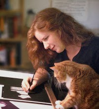
Well - posting has indeed helped light a fire under me on this piece. I decided to work on the second kitty (his name is Dufus.. believe me, he earned it!). I wasn't getting his face just right so I flipped my page upside-down. If you read my earlier post referencing Betty Edwards this may seem like a reasonable thing to do. But in case you're not familiar with such exercises I'll explain a bit.
Often when what we draw doesn't look the way we want it to it's because we're not seeing the subject properly. By putting both our reference picture and our artwork upside-down we force ourselves to truly look at it - not as Dufus the cat, but as shapes, values and lines and their relationship to each other. This, in essence, forces a shift to right-brain mode and generally results in a much happier artist when the work is turned back rightside-up.
My initial blocking in of Dufus:

And the current status (his face isn't completely finished - I still need to do a value check and add whiskers.. but I save those for last, they're my favorite!!):

While I had the image upside down I decided to tackle the 'problem' I mentioned earlier. I had used a really cheap pastel for the curtain, and although it doesn't show well on the image if you look close you can see that it doesn't completely coat the paper ('fill the tooth') leaving a grainy, dull appearance. Terrible! I honestly just wasn't thinking when I grabbed the pastel stick - but I've learned for myself what so many have told me - always work with the best materials you can afford. This is so true of pastels... had I worked much with those sticks initially I think I would have gotten very discouraged indeed!

So to fix the problem my plan was to remove as much of the pastel as I could - using a small foam 'brush' (the kind you get in the hardware store painting section) I started to gently whisk away the white. To my surprise the cheap pastel came right off! You can see in this picture the upper left corner that is still white, which I whisked as well - but that part was done with a higher quality white pastel pencil. The fix was much easier than I'd anticipated. After I whisked all of the old white off I coated it with a better white which fills the tooth nicely and stays put!!

So here's the current status of the picture - I've also made changes to the first kitty's eyes (Michael). Dufus' body will be next, then it will be time to tackle Nessie and the blanket under them.

But before I go back to it - it's time for a value check! In Photoshop I desaturate the image so I can see the values without worrying about color, compared to the reference photo it is easy to pick out places where the values are 'off':

The cushion behind him needs much lighter highlights, and the right side of his nose could stand some deeper shadows. His eyes are a little different than the reference - that is actually on purpose (sometimes you need a little tweaking to make the 'real life' picture look good).
I think that's enough posting for today - I'll catch you up when I've gotten a bit more done! Thanks for watching!


1 comment:
Fabulous post with great tips and I had forgotten how valuable working upside down can be. You have inspired me today.
Love the cats :) and I am not a cat person hee hee!
Post a Comment