Monday, November 24, 2008

A caffeinated diversion...

The other night I had a little artistic diversion - a product of my endearing love of coffee.

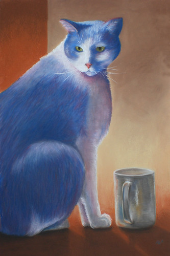
Those who know me are never surprised to find a trail of coffee cups leading to my studio. One of my residentmates even wrote a poem about a particularly famous coffee mug of mine (ah, Sylvester, I knew him well!). So a little while ago I came across Coffee Paper (see the Oct. 22 Blog entry) and now that it's arrived I'm trying to figure out what best to do with it.

The topic of this blog entry isn't actually the Coffee Paper. That was just what started the process - in brainstorming ideas about what to print on my special, new ecopaper this little guy just popped right out of my head....


That is exactly how I feel first thing in the morning, can you relate?

I know he's not what I usually post here - although graphic design isn't my MO, I do love tinkering in Adobe Illustrator from time to time. Well it turned out that he didn't look good on the Coffee Paper (so that particular quest continues) - however he spawned a series of like-minded illustrations...

Well.. I do!


"I've always dreamed of standing by a lake of coffee, but not like this! Never like this!"


If you're a math nut maybe you'll get the hidden message of what goes well with coffee (at least in Canada - go Tim's!)


The most dire of diagnoses... severe hypocaffeinemia requiring a stat CRI of java.... Scary!


Now although these guys don't fulfill my ecopaper need - after spending an evening with them I decided they'd look pretty cute on a T-shirt. So to that end I've uploaded them to Cafepress - if you're interested in buying a T-shirt (or other item) with one of these images on it click here (or you can click on any of the images above!). If there's an item not listed that you'd like with one of these designs just email me (Pam@catinaboxstudio.com)!

Next time I'll be back into the fine art category... now that I've had my coffee.

Wednesday, November 19, 2008

Still life "Bells" - Part 2 of 2


It is finished!

Unfortunately I managed to lose the in-progress photos that I took as I worked, so we'll just have to skip to the end!

Day 2 of work was much more difficult - I was having trouble getting into R-mode ("The Art Zone" as the hubby calls it) and it was the final stretch of the picture which is always more tedious than I think it will be. But the difference between 'art for fun' and 'art for work' is that I don't have the luxury of walking away - so I sat at the easel and kept plugging away. And here it is at the end of Day 2:


So after this it was time for bed - with four steps left until the end:
1) 'the hubby-check', 2) 'turning it to the wall', 3) 'peer review' and 4) 'revisions'.

It passed the hubby check with flying colors – though not an artist he has a good eye, and often points out trouble spots that I may have missed. One down.

Before I 'turn it to the wall' I make a few small notes – I'd like to darken the deeper crevices in the cloth in the upper half. I think the reflections on the upper half of the bells need to be darker, and there's a reflection on the third bell that I've not made clear enough. I wrote these on a post-it which goes on the easel beside the work-in-progress. Now I'll walk away from it for at least 10 hours, have a good night's sleep – and when I come back with 'fresh eyes' I'll see any errors more clearly.

Before bed I also posted it to Wetcanvas– a wonderful forum for artists of any kind! This is the 'peer review' part – artists of all levels will give me feedback on the work.

The next morning the notes on my post-it still are pertinent, I don't see any glaring new problems but a couple more tweaks I can do, such as tiny highlights over the surface - little dings in the metal that I hadn't noticed before. On Wetcanvas the feedback has been tremendously positive – I get some very good advice; to deepen the reflections (as I'd already noted) and to enhance my highlights with a little pale lemon yellow.

All of these go into Revisions.

FINAL PAINTING:

After the minor 'revisions' we're done!

I've framed it out to 16 x 20", slightly large for this painting but that's the size I have so it will have to do for the time being - it will make for a wide mat which increases the drama so I think it will work. This is a visually strong piece, so a clean white double mat shows it in it's best light.


I hope you've enjoyed this demonstration - leave comments if you have anything to share!

This picture is available as greeting cards on http://www.catinaboxstudio.imagekind.com.

- Pam

Monday, November 17, 2008

Still life "Bells" - Part 1 of 2

'Tis the season! Well not quite yet – I hate the fact that Christmas marketing creeps earlier and earlier every year as much as the next person, but by this point in November some Christmas carols start creeping into my house somehow. It occurred to me that I have a dearth of seasonal works – it's actually a bit late for me to be doing this, however my motto is 'better late than never' so I'm trying to get at least a few pieces done by mid-December.

I've been wanting to paint a still-life with pastels, and (Christmas theme aside) one of the objects that I've been planning is the string of 'jingle bells' I still have from the days when I owned draft horses. To play into the Christmas theme I set up my still-life on a red, satiny fabric.. like so:


Today I'll take you through the first phases of the piece - and I'll follow with another entry when I'm finished. I was able to get in a good right-brain R-mode last night and got a lot done in about 6 solid hours of work. I hope you enjoy!

Stage 1:

This piece is pretty small - about 6 x 11" on Wallis sanded paper. I 'primed' the paper first with a yellow-orange pastel stick, rubbing it in to change the background color from a cool grey-brown to this warm color. I sketched out the image with vine charcoal and did a quick upside-down check. I admit I was getting impatient to put down color, and at first I intended this to be a quick study, so I may not be spot-on but I was satisfied. At this point I have added some base color - it's a warm red (almost bordering on deep salmon).


Here is where mindset takes over. I just love surfaces like metal and glass - the reflections and distortions of color are amazing! They seem so complicated at first - but the key to painting these is to stop looking at the bells and only look at it as blobs of color. Note that I did not start by working on the background, then moving to the bells. I just laid down * all * the places that were red, then all the dark shadows. In some places the color on what will be a bell is exactly the same shade and value as the color of the cloth - this is called a 'lost edge', and it's keeping faithful to bits like that which makes a painting look real and believable. Our eye really wants to draw lines around everything - but there are no outlines in real life!

Stage 2:

So I'm getting well into R-mode by this time - I'm no longer seeing bells, just gentle curves of color and value! I start adding some deep browns to for shadow (I'm trying really hard to minimize my use of black), a little cool green in the deepest shadows of the red cloth to tone it down, some warm yellow highlights on the cloth, and I've started laying warm grays on the bells themselves.


Stage 3:

Now, magically, they're starting to look like bells - with depth! It's hard to not see bells now, but because I've been in R-mode for hours my left brain seems to have wandered off to do something else. This is why I like having a large block of time to work on a piece (and incidentally, I slept like a rock last night after this!). You'll notice how I keep circling all over - I don't want to have to think about my pencils too much (ie I don't want to work in one area then have to go back and sort out which pencil colors I've used when I move to the next). By working 'all over' I use the colors evenly over the surface and don't have to 'break stride' (I have to say this is much easier to do in a small piece like this!).

R-mode is still important here - there's such a strong pull to think of one quadrant of one bell as a distinct object. The key to these bells are the reflections - note where the reflections cross quadrants of a bell, those details are what will make them look 'real' at the end.


I'm also trying to preserve the fine detail - but not getting too hung up on it. An important place for this is on the cut edges of the bells - at this stage I'm trying to observe the colors (note how those edges are a combination of mid gray, light gray, dark gray, orange, red and light yellow - no edge is a single color it's whole length). It's important to realize that in pastel a fine line is often not created by drawing a fine line (jeez - why would you expect that?). Instead I draw a sort-of fine line and refine it further by adding a sharp edge of adjacent color - in pastel it's easier to get a single sharp edge than a thin line with both sides sharp. See the 'fine' red and gray lines in the middle of the leftmost bell? Look at it up close...


The bell's really taking shape now! I'm working the whole piece over as I go - adding highlights and shadows in the cloth, filling in the leather strap with layers. The oranges and yellows and salmon-reds need to be in the cloth (the only actual 'red' object), the bells and the leather - this is a very saturated image and the objects have to all relate to each other to make it ring true (oh dear, I didn't even mean that pun, honest!!).

Stage 4:

This is where I stopped for the night - the leftmost bell is close to done.


I'd like to point out what I found the most challenging so far - the interior of the bells! Clue #1 - they're not black! I used a very dark gray in the initial stages to mark out the place - but if I'd left it like that it would look flat. So looking very closely at the ref photo I see that there are subtle highlights in there - probably secondary (light bouncing of other parts of the bell) rather than a direct beam shining in through the slit (that looks more like the interior highlight you see in the middle bell). A light scumble of a deeper, gold color over the dark gray adds tremendous depth - now you can see the shadows inside, giving the impression of a concave surface.

Also, even though these bells are silver - I used a really warm light source for the ref, so adding a light yellow-orange around the highlight, blending it with the grays I'd already laid down, gives more 'shape' to it. And my favorite part - the bright white highlight! This is the first I've used pure white - again, white and black need to be used sparingly for the brightest highlights and deepest shadows (I learned that the hard way!). I usually put all the highlights and deep shadows in at the end - but after 6+ hours I just wanted a glimpse of how the whole piece will look when it's done!

Well I hope you've liked this little stroll-through-a-still-life!

I'll follow up with Part Deux once it's completed - now I have to get some real reds, as you can see It's more orange than red right now - part of that is intentional (I really want the final picture to be WARM, so using lots of orange and yellow underneath will make it shine!) but part is that I don't actually have any true reds in my growing pastel collection. Oh dear, a trip to the art store, what a chore! (LOL!)


Sunday, November 9, 2008

The end of an era

No, I'm not talking about the election!

I've called it - 'Hey, we're napping here' is officially done!


I'm not entirely happy with the blanket in the front, but it's achieved my goal of being there but being relatively subdued so as not to detract from the kitties.    It took a long time - and I won't be tackling another 14 x 22" piece in the near future - but it was worth it!

The piece is framed and will be hung as soon as I decide which venue it will fit best in!

And as a bonus - also finished is Cuppa!!  After my initial worry I was able to use some better pastels and some .. interesting techniques to rescue it.  I didn't always know what direction this one was headed, but I like the way it's turned out.  I had originally intended it to be a bit more abstract, but I guess I'm stuck somewhat on realism for the time being.  There are worse things!

Cuppa

Thanks for watching the process on Napping.  I'll post some more once the next things are under way!  If there's anything you've found interesting so far on my blog please leave a comment!

~~ Boots ~~


Tuesday, November 4, 2008

Update: Napping

A progress report on Napping (gosh this is a big piece).  I'm actually having more fun with this painting than I anticipated  - it occurred to me that all three kitties are fairly monochromatic - white, white and gray, and  gray.  But as I paint them, trying to stay somewhat true to the reference photo, it occurred to me that the play of warm and  cool tones within that limited spectrum is one of the things that made me fall in love with this picture - albeit, admittedly on a subconscious level.  

Michael, the white kitty, is the most neutral - he has subtle yellows and blues in his coat but the color  'temperature' balances out nicely.  Dufus, the middle kitty, is decidedly cool (in color, believe me in real life he's the biggest dork on earth).    The dark parts of his coat are underpainted with deep blues and the pencils used were predominately in the cool gray series.  Nessie, the latest addition, on the other hand is very warm (which is amusing, because in life this kitty is an ectotherm who likes to crawl into bed with us at night and plant her tiny ice-cube feet on any exposed human flesh she can find (like your face)).  When I roughed her in you can see the use of pinks and tans under the warm series of grays...


Nap-WIP10-small

Another value check...


Nap-WIP11-desatsmall

And here is where we are currently.

Nap-WIP13

I have taken a little artistic license and deepened the hues of their eyes, as well as brightening the highlights, compared to the reference photo.  I feel justified in doing so - I live with these guys, and their beautiful eyes are like jewels in reality which just wasn't caught well in the photo. 

(Detail - this is close to the actual size of the painting)

The next step will be the foreground blanket (oh why aren't they on a solid-color blanket?).  I was actually really excited about the blanket when I started this picture, now I am so close to finishing it that I just want to be done!  That'll teach me.. interesting objects are for still-lifes, not portraits!

Hopefully my next post on this one will be the finished piece!  'Cuppa' is almost finished as well (I was able to salvage it).   And then I'll have easel space for the next run of projects, including 'Sarah and Harley' which I haven't forgotten about!